open text

26 June 2005 at 18:36

new template

I'm just testing a new template. I'm not sure it's an improvement on the old one, but what do you think?

It should display like this
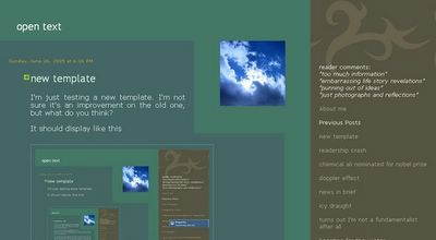


If you notice anything that looks wrong at your end (e.g. the cloud photo should have wide blue margin around it on three sides, and even wider blue above it), it would be nice if you could leave a brief comment describing what you see, what your PC's display resolution is (e.g. 800x600, or 1024x768) and what browser you're using e.g. Internet Explorer.

Thanks.

Blogger Hotboy said...

Adolf!
The photie of the sky looks good. I can't tell what resolutions I have on this computer, but you can find out from Blogpatrol.
The colour is yukky otherwise. It was better the way it was in my opinion, especially when it has nice photies of now older women looking younger and pleasant in the nazi uniforms! Just my opinion and I hope this has been a help. Hotboy  

~

Blogger onan the bavarian said...

Okay, I get the message - save the colour for the Brunhilde photos.

Thanks for the feedback.  

~

Blogger Hotboy said...

That colour is better. The whole layout of the comments bit is great as well. Obviously, you know something about all this computery stuff, Adolf!Hotboy  

~

Post a Comment


Who Links Here
Who Links Here (short form)

Where people click from:
Locations of visitors to this page